UPDATE: The competition is now closed.
Check out the Design Your Life logo and winners here!
You may know that we’re releasing the 12-month Design Your Life Program very soon.
This will be our most comprehensive program so far. It’s based on the popular Life & Goal Organizer DIY system, but I’ve chunked it down and made it accountability-based with monthly workbooks, weekly e-classes, action plans, accountability checks and exclusive member forums.
We’re now finalizing the logo, and want to choose something that resonates with you – our readers and customers.
Would you please take a look?
I’ll pick one commenter to receive an entire 12-month Design Your Life membership as a prize.
Colors
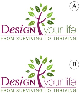
Above you’ll see 2 color combinations
Which do you prefer?
- A
- B
Tag Lines


Above you’ll see 2 tag lines in addition to the topmost one.
Which do you prefer?
- From Surviving To Thriving
- Your New Life Starts Here
- The New You Starts Here
Please leave your feedback as a comment.
And thank you – I very much appreciate your time and thought. 🙂
![]()


Hi Michelle
I like colour combination A because through a change in colour from purple to green, it represents a distinct evolution from the current state to the intended future state. Green is also the colour for go, and reflects the colour of grass, nature and ecology.
This aligns with my favourite tagline of “from surviving to thriving” which again implies a positive metamorphosis from one state to another. When I read this tagline I immediately feel a sense of relief that this offers a solution for me, and is something I want to check out further. I am “called to action”. That I could thrive even though I am currently just surviving amidst a busy life with fours busy gorgeous boys.
I can’t wait to read more about your exciting programme and how I can shift from surviving to thriving…
Love & laughter
Kara
I like the last one, it’s catchy – a call to action – and very appealing visually.
Your new life starts here.
Love to interview and jv with you by the way, my tagline is Design A Life of Rich Rewards, I’m all about life makeovers!
Love
Cyd x
I like the last one, it’s catchy – a call to action – and very appealing visually.
Your new life starts here.
Love to interview and jv with you by the way, my tagline is Design A Life of Rich Rewards, I’m all about life makeovers!
Love
Cyd x
Hi Michelle,
I like Color A because you go from the red color of just surviving to the green color of thriving and growing and it becomes kind of spiritual. It is a great logo and a great idea.
So I guess you know that I like Tag line 1 From Thriving to Surviving it is really insightful into not only many people’s lives, but my life! My life of mom to 4 , one in college – three still home ages 13 thru 4 – Home Office, fibromyalgia, migraines, and DH of 21 years. I want to go from just surviving to thriving, to being like that tree in your logo, all green and vibrant and healthy! That is too cool!
Colour combo A is easiest on the eye & I like ‘from surviving to thriving’
Go girl! Bx
Colour combo A is easiest on the eye & I like ‘from surviving to thriving’
Go girl! Bx
Hey Michele,
Color B
I would go with design B for the colors. It has a more uniform and balanced look with the colors. I feel that this design better suits the product since it is to balance your life. However, I noticed that the tail of the “y” from “design your life” connects to the line that underlines “design your life,” unlike design A. I like the look of the “y” dipping slightly below the line in design A.. I would change design B to do the same thing.
Tag Line 3
I choose “The new you starts here.” It rolls of the tongue better than the other two. The first one has a negative air about it which may put people off a little and the second one… its fine but I just think the third option is a bit more catchy.
-Christi
Hi Michele:
It took me awhile to see the differences in the two designs . I like the A color combination. It starts with purple and ends with green writing. When I see green for money. I need to try to save a small part of my disability each month so there is a small balance carried over in my account.
RT @MicheleConnolly: This w/end is last chance 2win 12-mth ★Design Your Life★ m/ship. Leave ur logo opinion on this post: http://is.gd/3Slbw
RT @MicheleConnolly: This w/end is last chance 2win 12-mth ★Design Your Life★ m/ship. Leave ur logo opinion on this post: http://is.gd/3Slbw
First of all, the new design in beautiful…I really like it!
I vote for A for the colors and like “The New You Starts Here” for the tagline.
First of all, the new design in beautiful…I really like it!
I vote for A for the colors and like “The New You Starts Here” for the tagline.
My vote is for “B” in the colour combo. And “B” for The new you starts here.
Looks great Michele. 🙂
My vote is for “B” in the colour combo. And “B” for The new you starts here.
Looks great Michele. 🙂
Color scheme A
Tag line 2
Color scheme A
Tag line 2
Hi Michele,
My vote is for the color combo B because the continuity in the color goes with the phrase.. wouldn’t want to break the phrase by changing colors.
I like the tag line #1 From Surviving to Thriving because I think it really captures how people feel, that they are just surviving in current mode of operation. I prefer that over creating something new for a couple of reasons: NEW sounds like TOO MUCH WORK and like starting over. We can capitalize on our strengths and experiences as we work to better ourselves and create the life want. We all want to THRIVE!
I appreciate your expertise. You have really motivated me! I hope that I win the prize! I know it will be valuable to anyone using it!