On December 1 I’m releasing a very exciting new product called 52 Weight Loss Missions. I think this is my best product yet.
52 Weight Loss Missions: A Radically Different Approach
For most of us who struggle with weight loss, the problem isn’t what we don’t know, it’s what we don’t do.
This is where 52 Weight Loss Missions is unique. The program:
- Includes 52 action-based missions
- Focuses on actions that are smart and strategic
- Covers diet, exercise and mindset
- Helps you change the path of least resistance so eating, moving and thinking right get easier
- Draws on psychology and life coaching to help you win the mental battles
- Uses a range of cool tools to keep you committed and accountable
- Offers hundreds of practical ideas and strategies
- Is succinct and easy-to-read – 100% fluff-free
- Rewards you for taking action.
Which Logo Do You Like, And Why?
I have three potential logos for this new product – and I’d really appreciate your feedback on which one you like best, and why.
(By the way, the logos might seem a bit girly because my research tells me it’s mainly us girls who struggle with this stuff. But the program content is gender-neutral. And if you guys want one, Ill do a dude version just for you. :))
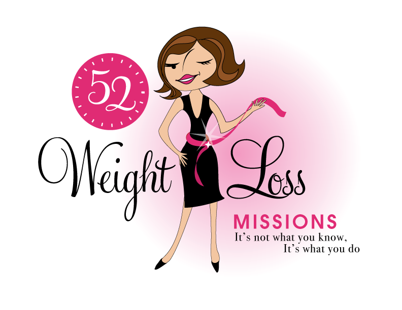
Logo 1

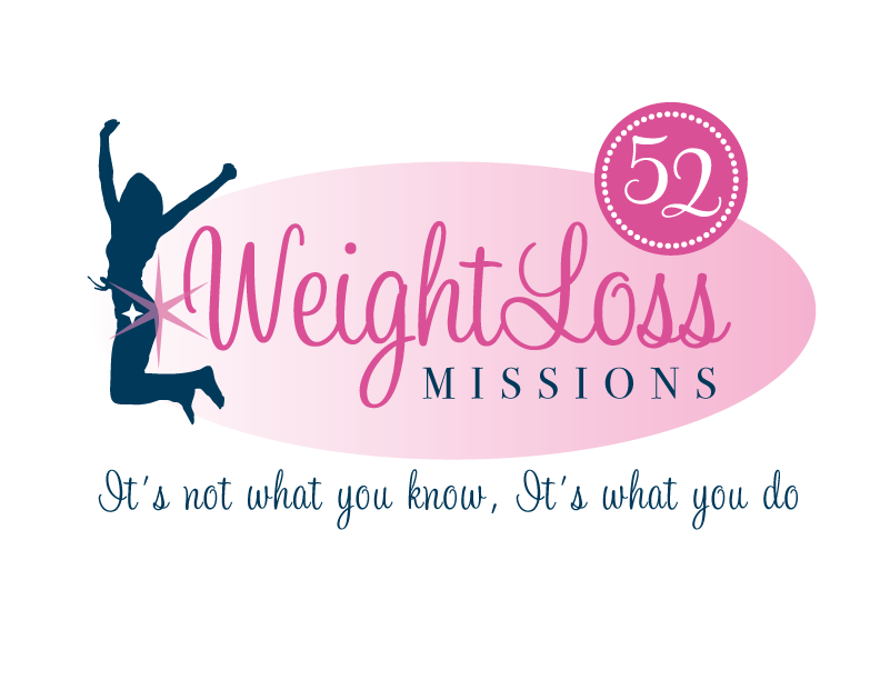
Logo 2
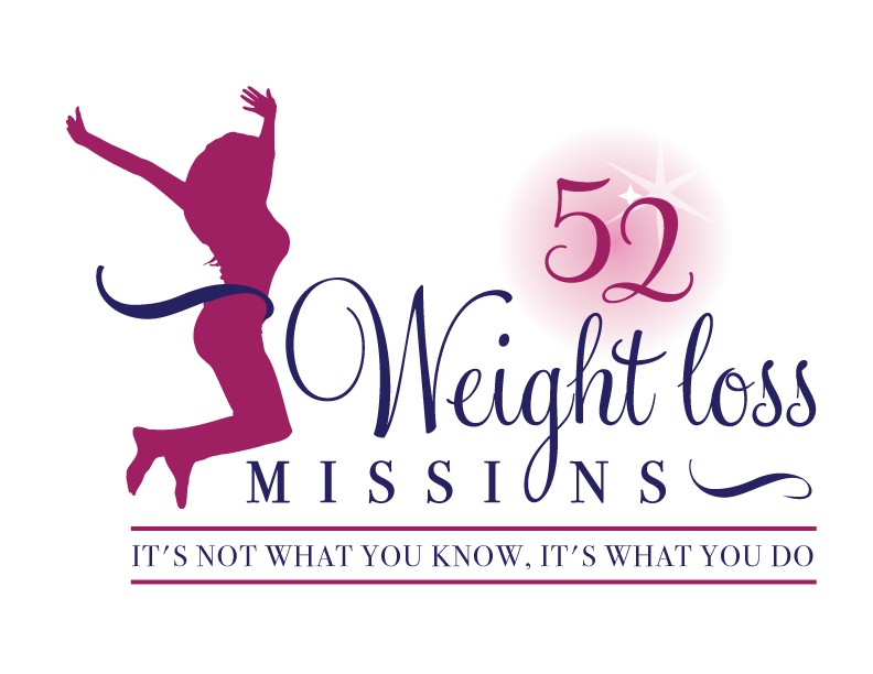
 Logo 3
 Cool Prizes
I’ll pick two commenters to receive a copy of the 52 Weight Loss Missions Action Pack as a prize. The Action Pack includes 52 Weight Loss Missions plus a range of interactive materials including a Workbook, Journal, and Planning Tools.
Want To Know More?
If you want to know more about 52 Weight Loss Missions:
I’ll let you know about special introductory offers and I’ll also announce the winners in both places.
Thank You!
I really appreciate your feedback. And good luck!
Leave a comment on this post to tell me which logo you like best, and why.

![BRAND NEW ‘52 Weight Loss Missions’ Logo Survey [I’d love your feedback! And there are cool prizes.] 1 Logo1 Logo1](https://www.getorganizedwizard.com/wp-content/uploads/2011/10/Logo1.png)
I like number 1. I like the “clock” at the top – time to make ourselves a priority; the wink – I know something and I want to share it with you; and the overall look is retro, reminds me of Mary Tyler Moore, Donna Reed – a time when life was simple.
Only number one will do.
It matches your other products.
The other ones just aren’t ‘Michele’ enough.
I like the third one best. The woman in it is more realistic looking, not Barbie doll-ish…a shape which is more easily attainable.
My second choice would be number one because it’s an obvious cartoon, young girls seeing it would take it as such and not expect that is a shape they should have.
I like the first logo best. Its cute and fun. More appealing. I dislike the “52” the most on #1 though. But overall, logo one was most eye catching to me. 😉
I like number 2 best of the three. I like it best because you can’t see the woman up close like the other two. I like that the woman is doing something sporty like jumping up in the air, it’s more athletic than the other two. I don’t like the proportions of number 1 it’s barbie dollish! Unattainable!
The first one seems much more like you and things I have seen from you. I like the simple lines and balance of it.
#3. Because the woman figure used is not a specific race, it can be representing anyone. Plus the colors are appealing to the eye.
Number 1 for me! It’s fun & fiesty!
I like the first one! I looks more fun and its good because its a cartoon of you (I assume) so its in keeping with the other cartoons on your products 🙂
I like the first logo. The image of the woman makes it more real.
I like number 1. She alluring, kinda has that look of see what i did and i look awesome just saying. the pink ribbon is plus, love it. i like the look of logo number one over all.
i like logo 2 because when i see it, it represents victory. i struggle with my weight and weight loss and this logo would encourage me to keep working towards my goal making me victorious!
I like Logo 2. The nose on 1 is odd and she looks too thin. The pic in 3 looks like she has a big posterior. They’re all good though. I think I’d like 3 best if you reversed the pic from 2 and put it on there.
I like #1 – I really like the lady with a ‘measure tape’ around her waste, it just makes more sense then the other for what you’re trying to say and promote. The lady looks inviting like it wants to show you how to lose the wait, keep it off, and give good advise for any weight issues.
Sara
South Dakota
I like the first logo best. The jumping , happy woman tends to show up in quite a few logos whereas the woman in the first logo is more unique. Plus she is the only one where we see any of her features and characteristics making her (and what she is doing) more personal to the viewer.
I like the first one better. While the other two are clean and maybe more professional looking, the first one is more fun and inviting. As someone who has tried several attempts at weightloss, I’m tired of the “same old, same old” and the first one draws me in the most.
I love the first one, its got attitude and personality, different to all the rest you see promoted all the time!
I like Logo number 1, it’s cute and fun and even if I didn’t know what it was about I would check it out just because it’s cute. 😉
I like the first one – the black and pink is very chic, and the “wink” and curvy female image add elements of fun. It also reads correctly left-to-right, where the others are a little bit chopped up. Keep up the good work!
I like Logo 2 ..
I like it’s clean lines .. and style 🙂