On December 1 I’m releasing a very exciting new product called 52 Weight Loss Missions. I think this is my best product yet.
52 Weight Loss Missions: A Radically Different Approach
For most of us who struggle with weight loss, the problem isn’t what we don’t know, it’s what we don’t do.
This is where 52 Weight Loss Missions is unique. The program:
- Includes 52 action-based missions
- Focuses on actions that are smart and strategic
- Covers diet, exercise and mindset
- Helps you change the path of least resistance so eating, moving and thinking right get easier
- Draws on psychology and life coaching to help you win the mental battles
- Uses a range of cool tools to keep you committed and accountable
- Offers hundreds of practical ideas and strategies
- Is succinct and easy-to-read – 100% fluff-free
- Rewards you for taking action.
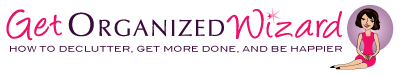
Which Logo Do You Like, And Why?
I have three potential logos for this new product – and I’d really appreciate your feedback on which one you like best, and why.
(By the way, the logos might seem a bit girly because my research tells me it’s mainly us girls who struggle with this stuff. But the program content is gender-neutral. And if you guys want one, Ill do a dude version just for you. :))
Logo 1
![]()
Logo 2
 Logo 3
 Cool Prizes
I’ll pick two commenters to receive a copy of the 52 Weight Loss Missions Action Pack as a prize. The Action Pack includes 52 Weight Loss Missions plus a range of interactive materials including a Workbook, Journal, and Planning Tools.
Want To Know More?
If you want to know more about 52 Weight Loss Missions:
I’ll let you know about special introductory offers and I’ll also announce the winners in both places.
Thank You!
I really appreciate your feedback. And good luck!
Leave a comment on this post to tell me which logo you like best, and why.
![]()
Number 1 – It’s fun, vibrant and represents a more natural perspective. Wieght loss is journey and commitment and the first logo shows a more realistic image for the journey that is ahead
# 1 is my favorite but love the font on # 3!
I like #1 its looks like the product is fun.
I like the 1st one. It is cute. Woman want to be femine, fun and fashionable. If you could make her slightly ‘larger’ would make it better. The other two are so clinical and sterile.
I love #1…I have about 20 lbs to lose and I would be attracted to that logo over the other two in a heartbeat! It has a definite “flair” to it that the others are missing. I also think #1 ties the message you are trying to portray together better than the others. All of them look great…but #1 is definitely my fav!
I like number one the best. Having an actual face on the woman makes it seem more personal. She’s kinda sassy too, which I like. Not crazy about her nose though.
No 1 is a winner for me with the promise of some fun and that gorgeous glint in her eye. thus covering what you say, mindset! we all want that glint! I find no2 and 3 too staid. perhaps too corporate. this is a personal issue and needs a program has that personal touch hence my choice! Keeping tabs on the progress and cant wait! good luck all!
Logo #1
#3 is my fave. States the mission clearly. All women can identify with it…doesn’t look like one specific person. Elegant. I like them all but this is my favorite:)
Number 1. It’s flirty, classy and almost vintage. Looks like someone who has it all together, the way I would like to look!
Hi Michele,
I prefer Logo 1 because of the text (font) and the overall look of it. I think it fits in more with your site here, and has more of a friendly feel to it, therefore adding the camaraderie that can go with successful weight loss.
Just my opinion of course, but you did ask for it!
Thanks,
Nikki
I love Logo 2. It has just the right pizazz! The woman jumping with excitement and the star makes me feel like I could be that person jumping for joy that I can do it. I also love how the tag line stands out in this logo.
I like #1 the best. I don’t like the silhouettes. The cartoon lady grabs my attention.
I like the second one best.
I like the first one. It’s kinda old school, and is reminiscent of women always looking beautiful whether they were just cleaning the house or out shopping! Very appealing!
Number one…far and away the best one!
I like parts of all of them, but #3 is my favorite because the figure is a realistic size and she in jumping towards the goal with open arms. In #2 the figure is jumping away from the “mission” and for some reason there is a star on her rear…. # 1 would be OK if not such a tiny waist and arms/legs.
Nn 1. Colourful and reads the right way left to right without using the loops of other letters to form letters themselves. I read #3 as missins first up.
I love #1. It sums up what most ladies want.
Slender curves – not a bulge in sight. The promise
Of that would certainly make me buy the product!!
#3 is my choice. They are all great. #1 is a little old fashioned but that’s coming back. I had to pick one so it’s #3. Thanks! 😉