On December 1 I’m releasing a very exciting new product called 52 Weight Loss Missions. I think this is my best product yet.
52 Weight Loss Missions: A Radically Different Approach
For most of us who struggle with weight loss, the problem isn’t what we don’t know, it’s what we don’t do.
This is where 52 Weight Loss Missions is unique. The program:
- Includes 52 action-based missions
- Focuses on actions that are smart and strategic
- Covers diet, exercise and mindset
- Helps you change the path of least resistance so eating, moving and thinking right get easier
- Draws on psychology and life coaching to help you win the mental battles
- Uses a range of cool tools to keep you committed and accountable
- Offers hundreds of practical ideas and strategies
- Is succinct and easy-to-read – 100% fluff-free
- Rewards you for taking action.
Which Logo Do You Like, And Why?
I have three potential logos for this new product – and I’d really appreciate your feedback on which one you like best, and why.
(By the way, the logos might seem a bit girly because my research tells me it’s mainly us girls who struggle with this stuff. But the program content is gender-neutral. And if you guys want one, Ill do a dude version just for you. :))
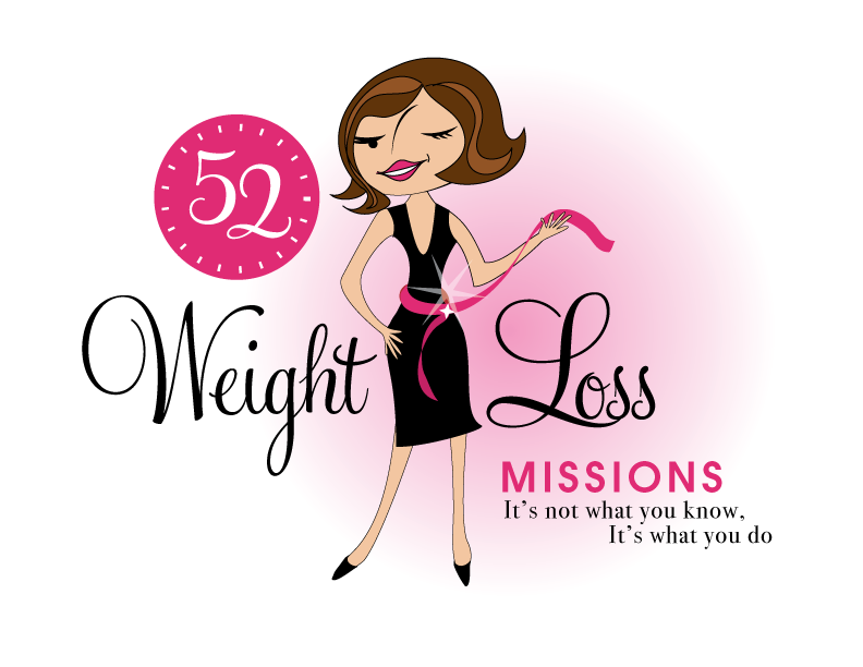
Logo 1

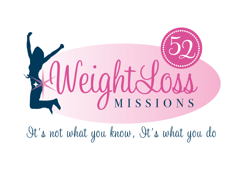
Logo 2
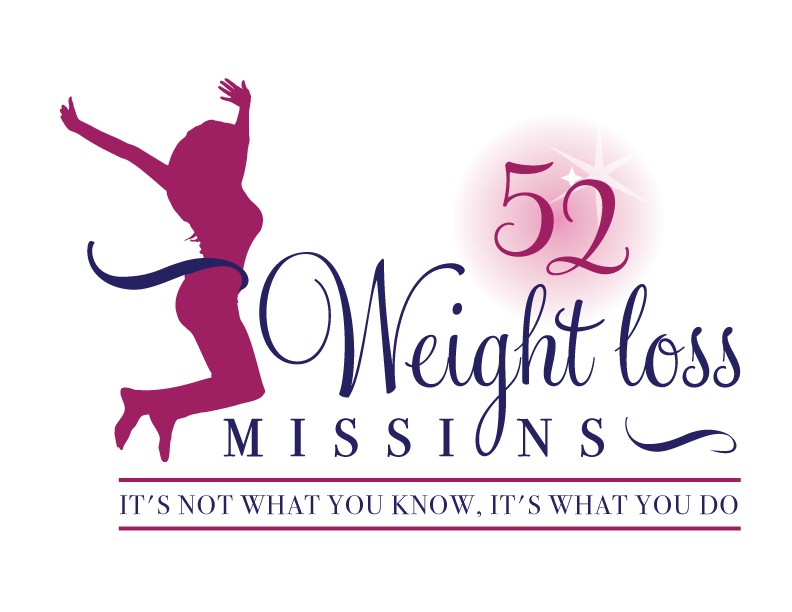
 Logo 3
 Cool Prizes
I’ll pick two commenters to receive a copy of the 52 Weight Loss Missions Action Pack as a prize. The Action Pack includes 52 Weight Loss Missions plus a range of interactive materials including a Workbook, Journal, and Planning Tools.
Want To Know More?
If you want to know more about 52 Weight Loss Missions:
I’ll let you know about special introductory offers and I’ll also announce the winners in both places.
Thank You!
I really appreciate your feedback. And good luck!
Leave a comment on this post to tell me which logo you like best, and why.

![BRAND NEW ‘52 Weight Loss Missions’ Logo Survey [I’d love your feedback! And there are cool prizes.] 1 Logo1 Logo1](https://www.getorganizedwizard.com/wp-content/uploads/2011/10/Logo1.png)
I prefer logo one. The 52 surrounded by a clock motivates you with the idea that it’s only a matter of time to a better you. The 52 being large and surrounded by tiny tick marks reminds me that it’s a process of small changes not a quick fix fad.
I love the woman in a little black dress and the way she’s winking. She has knowledge that she’s willing to share, and if you follow her she’ll let you in on the secret. Who wouldn’t want to be standing confidently poised in a little black dress one short year from now? The font of the slogan makes it simple. We all think we know the right things, but it’s in the doing that we fall short.
To me none of them are 100% perfect, however, with a little tweaking I think you have a winner! The 2nd one is my least favorite, the star burst on the left side is placed right at her “back-side” which kind of brings to mind a cartoon representation of someone “releasing gas” (but maybe that’s because I have two 8 year old twin sons and not a day goes by that there isn’t some reference and laughter due to bodily functions…lol). The 3rd logo just doesn’t stand out enough. The one I like the best overall is logo #1, it is eye catching. It makes me want to know her hidden secret. I like the use of the pink measuring tape around the waist. The order of the words makes it flow better and easier to read. The only thing I don’t like about #1 is the face. I do not care for her nose and her right eye looks odd at first glance. But then I realized that she was winking (I love this idea because she is getting ready to reveal her “secret” to weight loss). With some adjustments to her facial features (a different nose and maybe putting a little “twinkle” symbol or something by her right eye to better represent the action of her winking) I think this logo should be your winner! Great job! Just looking at the logos already has me curious about this tragedy for weight loss!
#3–first thing I thought when I saw it was it conveys energy–and doesn’t take away from the It’s Not what you know-it’s what you do message.
I like Logo number 2 the best. When I look at it, I feel energy, joy & optimism.
I didn’t care for logo 1 as much because the figure looks kind of old fashioned 1950’s type style. I didn’t care for logo 3 as much because the figure seems too ‘shapely’ to me and seems to highlight societies image of what women should look like and I don’t so it immediately makes me discouraged.
I like Logo #1 – the colors pop and it looks like it could be any busy woman out there trying to be successful (at anything!) For the exercise phobic, Logo #1 doesn’t look like it has anything to do with exercise, where 2 and 3 both look like the woman are doing just that. Logo #1 just look a lot more like fun!
I look forward to reading the book – its a new spin on weight loss. Everyone knows what to do, it is doing it that is the hard part! Making it a mission makes it seem like it can be accomplished 🙂
This was a great exercise! When I look at the elements of the logo (breaking it down) my mind wants to say #3 (clean, better sized woman, facing forward.. many of the things mentioned above).
BUT, if I go for my purely emotional response, it’s hands down #1. Yes, she might be a bit curvy, but it’s a cartoon character. I love the 52 clock, the ribbon around her waist with the sparkle and the playful nature of the whole look. And this is ironic because normally I’m not attracted to logos with cartoon characters. Often I see them as less professional and less serious about getting results.
My question to you would be: which better describes you or the content? More logical, straightforward, focussed? (#3) More fun, relaxed and playful? (#1)
Thanks for seeking our input, and keep sparkling!
Paula
I really like that logo 1 catches the eye but would love a more realistic figure on her if that could change it would be perfect. So many time we feel that women are expected to be toothpicks to be beautiful when being healthy is most important. thanks
I like #3 the best because the image of the “girl” looked more real to me than the other two (especially the first one, which was too animated and had a waist size that I could never relate to!:) Also, I liked how #3 framed your slogan. This made it really stand out and drew my attention to what was really important!
Oh, to add to my previous entry. #1 does look like more fun. To quote another of my favorite online ‘friends’ – “If it’s not fun, it won’t get done!”.
🙂
#1…It makes me feel like you product is fun and all about women!
Good Luck!
#1 is my favorite. She catches my eye and has more color. The first logo is the easiest to read. Her personality, and ‘aura’ would intrigue me, and I would want to read more. She is also more of a symbol for a well rounded, successful, program, including many elements of a weight loss program. #2 and #3 seem to focus on excercise (which is an integral part of a weight loss program), but I would think it revolves around excercise ONLY or mainly, and wouldn’t bother to read more. Also, you see similarities of the two logos around, introducing the thought ‘more of the same’. Of #2 and #3, I believe #2 is best. She is jumping enthusiastically, and head on, into the program. You believe she will be victorious.
Good Luck!
I like #3 – to me, the female in this picture looks victorious and that would make you automatically assume that she reached all her goals: her goal in diet/weight loss, her goal in mindset, and also her goal in exercise!
I like Logo 1. Although I agree that the character could be more natural shaped.
I like #2 – it looks like she’s ecstatic because she’s finally free from the struggle with weight and joyful – and that is what it’s all about!
i like the first logo. it makes you want to lose weight, like the lady with the trim figure looking enthusiastic. it looks appealing and interesting
I like number 2 the best. The woman in the logo looks victorious, which is how I feel when I have lost weight and am feeling good.
Definitely #3 because of the energy it sends out.
As others have said the woman could be anybody, and her size is realistic.
The letters and numbers in the headline has about the same size (52 weight loss Missions) and gives a better whole to the picture.
The logo is simple and elegant – but most importantely – THE ENERGY IS AMAZING !!! 🙂
(I do see that the woman in #1 has charme, but to me she looks from the 1950’s or so….)
Logo 3. Clean, color matched and gave a straightforward message.
Logo 1 is my favorite, followed closely by Logo 2. The concept sounds intriguing!
I prefer number 3. I like the victorious jump of the woman and that her size doesn’t emphasize an unrealistic small size. I like the font. I also like the balance with the blue measure on her waist and a matching shape to finish your title on the other side. There’s also better attention lent to your subtitle and a gentleness to the number, that makes it a better part of one seamless overall look.