On December 1 I’m releasing a very exciting new product called 52 Weight Loss Missions. I think this is my best product yet.
52 Weight Loss Missions: A Radically Different Approach
For most of us who struggle with weight loss, the problem isn’t what we don’t know, it’s what we don’t do.
This is where 52 Weight Loss Missions is unique. The program:
- Includes 52 action-based missions
- Focuses on actions that are smart and strategic
- Covers diet, exercise and mindset
- Helps you change the path of least resistance so eating, moving and thinking right get easier
- Draws on psychology and life coaching to help you win the mental battles
- Uses a range of cool tools to keep you committed and accountable
- Offers hundreds of practical ideas and strategies
- Is succinct and easy-to-read – 100% fluff-free
- Rewards you for taking action.
Which Logo Do You Like, And Why?
I have three potential logos for this new product – and I’d really appreciate your feedback on which one you like best, and why.
(By the way, the logos might seem a bit girly because my research tells me it’s mainly us girls who struggle with this stuff. But the program content is gender-neutral. And if you guys want one, Ill do a dude version just for you. :))
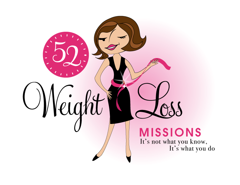
Logo 1

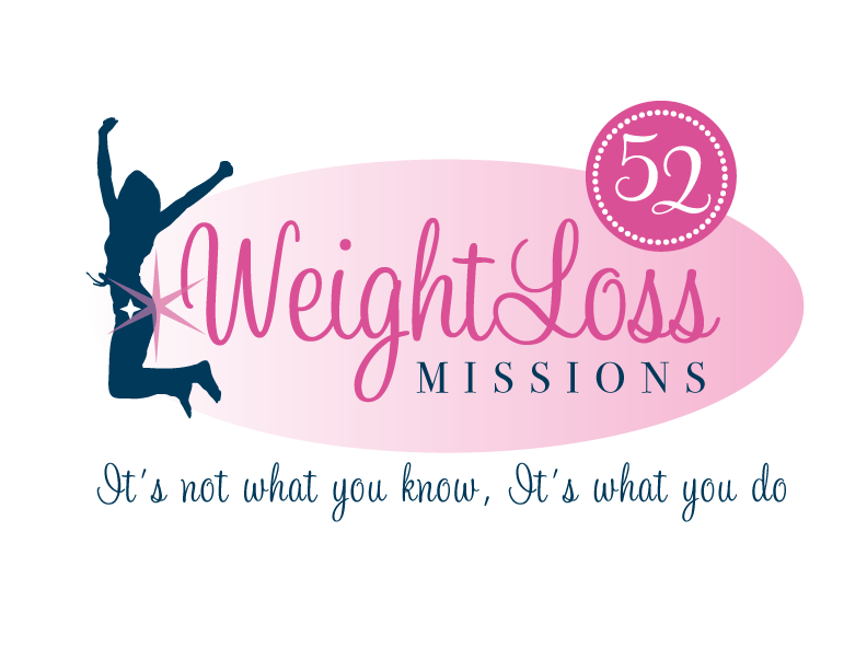
Logo 2
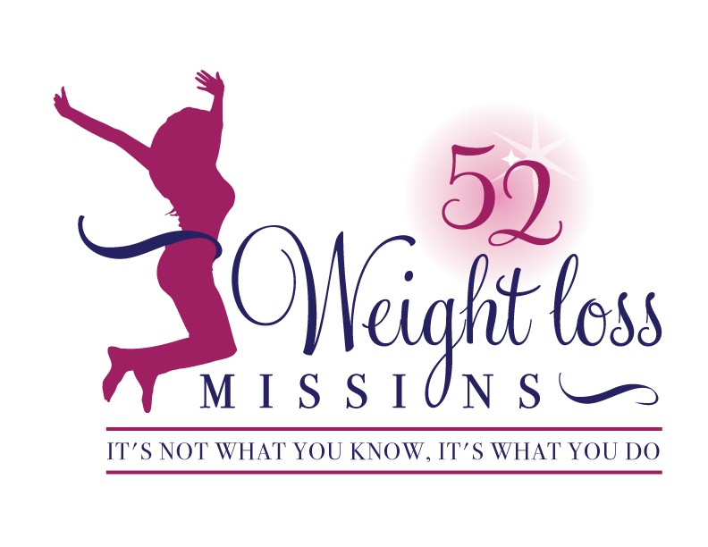
 Logo 3
 Cool Prizes
I’ll pick two commenters to receive a copy of the 52 Weight Loss Missions Action Pack as a prize. The Action Pack includes 52 Weight Loss Missions plus a range of interactive materials including a Workbook, Journal, and Planning Tools.
Want To Know More?
If you want to know more about 52 Weight Loss Missions:
I’ll let you know about special introductory offers and I’ll also announce the winners in both places.
Thank You!
I really appreciate your feedback. And good luck!
Leave a comment on this post to tell me which logo you like best, and why.

![BRAND NEW ‘52 Weight Loss Missions’ Logo Survey [I’d love your feedback! And there are cool prizes.] 1 Logo1 Logo1](https://www.getorganizedwizard.com/wp-content/uploads/2011/10/Logo1.png)
I like #1. It really stands out. However I keep getting stuck on the figure’s nose. It seems to be going the wrong way for me. Slightly darker skin tone seems like a good thing too.
I like the second one best, as reflecting both the spiritual/internal aspects of weightloss and what you actually have to do to achieve it (exercise). I don’t think the first logo matches the idea of weightloss at all.
Sorry the last line should have read kind of “LIKE” the nike swoosh 😀
#3 is the best as far as I am concerned. I like the fonts and the coloring of this one. Women is realistic and one that we can believe in.
I like #3 the best – I tend to agree the woman is the most realistic looking of the women. Also since you are such a savvy business woman I think the logo alone is simple & elegant enough to highlight & market any spin off products… whether it be the cover of a workbook, corner of a worksheet, t-shirt or whatever – kind of the the nike swoosh 😀
I like #3 as the woman’s shape is healthy and she is also obviously fit (hence the big jump!). She’s not a super skinny anorexic model. Also, the know vs do section at the bottom is highlighted to remind me I already know what to do, you’re just going to gently help me do it!
I like logo # 1 best.
Can’t wait (weight!) to hear more about this project!
I like #2. It has energy, and makes me want to keep working on my weight issue.
I like #2 best. The figure in motion helps to suggest action so it conveys the idea well, and I like the rest of the design better than #3.
I like logo number 1. Cartoon or no, she’s easier to relate to than the other two. Numbers 2-3 remind me of something for teenagers and let’s be honest- most of us struggling are way out of our teens!
I like number 1 best. It’s fun and it’s more catchy thant the other two. plus number two and three remind me of the logos of a women’s gym and some slender food brand.
I think number it’s different enough to catch the eye of anyone who wants to loss weight but it’s looking for something different. Just one thing: the wink hasn’t come alright; I’d change the design or just have the girl with both eyes open.
I like #1 best.. #2 and 3 are similar and they both look ‘familiar’ to me, like they’ve been done before.
#1 is the most eye-catching. It’s cute and kinda of retro, reminding me of the early tv show Bewitched’s opening graphics.
Due to body dysmorphic disorder, and the push for health versus ideal weight and body types, I choose #2 . # 2, from my perspective, may be more encouraging to men to participate as the female form isn’t as prominent as the others. Also, the tape measure implies focusing on reduction versus health, which can trigger dispositions to eating disordersi. PS …love the stars too 😉
I’m really encouraged, and can’t wait for this. Thanks Michele !
I think #1 matches your range of products more, but I think #3’s picture is
more “real” for me as someone who is trying to lose weight. Great idea though, I really like the idea of the 52 missions. I’m doing weightwatchers at the moment, but I’m having trouble trying to find an excercise programme which “fits”. The idea of missions would alieviate the “sameness” which gets boring.
Logo 2 is the best. Stars on a siluete are a but imballanced, but it gives a message of a well being and radiates energy outwards.
Logo I nice, but gives message that looking weight is about looking beautiful, which is not quite right in opinion of many today including many doctors. These days it’s more about wellbeeing and feeling good, not for the sake of looking good (shame to let this one go, as animated lady is really cool!!!)
3rd feels a bit busy and enclosed, the energy radiates inwards. Outward energy like in 2nd logo probably relate more the the concept if wellbeeing. But live this siluete more then on logo 2 – open palms and fingers give a feeling of freedom, fun, and lightnes. Wrists in logo 2 are tights and more gym like.
I like the 2nd one the best, the first is too cutesy, the third one appears as if all the elements are given equal “weight” (no pun) and nothing stands out…your eye doesn’t know where to rest.
I like #1 the best for what you are promoting. The others look more like boot camp, or a general improve you health and happiness logo.
Like most of the comments I scrolled through to get to comment box, I like Number 1 the best. It is flirty, fun, cute and more “personal” even though I don’t look anything like the logo character.
I like #3 the best. It was the first to really catch my attention. The words of the bottom line jump out at me, and I think they are very important to notice. You barely see them in #1, slightly better in #2, but best in #3. The overall logo is well balanced in #3, and the woman facing the rest of the logo is much more affirming/positive and embracing it. The one facing away in #2 has a negative feeling, like she can’t get away fast enough.