UPDATE: The competition is now closed.
Check out the Design Your Life logo and winners here!
You may know that we’re releasing the 12-month Design Your Life Program very soon.
This will be our most comprehensive program so far. It’s based on the popular Life & Goal Organizer DIY system, but I’ve chunked it down and made it accountability-based with monthly workbooks, weekly e-classes, action plans, accountability checks and exclusive member forums.
We’re now finalizing the logo, and want to choose something that resonates with you – our readers and customers.
Would you please take a look?
I’ll pick one commenter to receive an entire 12-month Design Your Life membership as a prize.
Colors
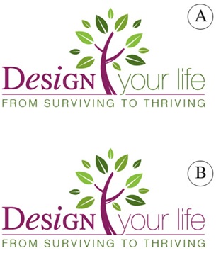
Above you’ll see 2 color combinations
Which do you prefer?
- A
- B
Tag Lines


Above you’ll see 2 tag lines in addition to the topmost one.
Which do you prefer?
- From Surviving To Thriving
- Your New Life Starts Here
- The New You Starts Here
Please leave your feedback as a comment.
And thank you – I very much appreciate your time and thought. 🙂
![]()


Hi Michele I think the colours in A are well balanced and with 25 years in publishing i would go with “your new life” as it gives the client ownership. But at the end of the day which logo are YOU most passionate about?
As this will be the one that empowers the most!
Good luck.
Design A
“From Surviving to Thriving” – I agree with Katrina, above.
Design A
“From Surviving to Thriving” – I agree with Katrina, above.
If I had to choose, I would choose Design B, but please, please do NOT use Times New Roman for the serif font. I would highly recommend a font like Filosofia Unicase instead, available at http://new.myfonts.com/fonts/emigre/filosofia/unicase/
As for the slogan, I like “Your New Life Starts Here.”
If I had to choose, I would choose Design B, but please, please do NOT use Times New Roman for the serif font. I would highly recommend a font like Filosofia Unicase instead, available at http://new.myfonts.com/fonts/emigre/filosofia/unicase/
As for the slogan, I like “Your New Life Starts Here.”
Color A
Your New Life Starts Here
YOUR makes it personal and speaks to the reader.
Color A
Your New Life Starts Here
YOUR makes it personal and speaks to the reader.
Colour scheme A…More green is calming, and having words in different colours gives each word more ‘punch’.
” From Surviving to Thriving” is my favourite for 2 reasons….the name rhymes and so rolls off the tongue and is easy to remember. Also because the other 2 have no ‘ownership’ of the life….sounds as though you are promising something which is not theirs, rather than improving what they already ‘own’.
I preferred the B colour scheme as it helps the words ‘ Design your life’ flow more easily. The changes of font in the word ‘Design’, already create an interesting movement.
‘Your New Life Starts Here’ appealed more because it conjures up something more wild and wonderful than just thriving. Plus, it is more positive than using the word ‘you’ which infers that there could be something wrong with ‘you’ that has to be beaten into shape. :o)
Hello Michele and team,
For me color combination A is easier on the eye; creates a flow through the logo. And I agree with Carmel; “Thriving” combines very nicely with the plant symbol, which makes the new logo a whole, not just loose parts.
Exciting new program! Nice to see you’re in this advanced stage already 🙂
Hi Michele
Love Design A with half green, half purple colour.
am struggling with “From surviving to thriving” for no other reason than one has to put effort into thinking it through. your other choice “Your new life starts here” can be grasped quicker somehow. I prefer it. Good luck with this. Warmest wishes Catherine
Loved A and the A tag line as well, without doubt.
“Thriving” ties more meaning to the plant growth symbol for me. Love it.
There can always be new life but for that life to thrive well is something else.
The contrast word “surviving” is also meaningful to me as this is how I saw our life living in the city, compared to now living in Regional NSW.
Cheers
Carmel
I liked B better. The colors pop out more and it looks good to the eyes.
I liked B better. The colors pop out more and it looks good to the eyes.
I agree – A is best for colour and I personally prefer Your New Life Starts Here as “thriving” is not good enough for me either! (And I am the type who tends to change everything all at once, although I know not everyone is like that!)
Having said that (and I know it would mess up the design, or might) I think a more powwrful energy-rich word in between “Your” and “New” could be just what it needs and could tie in with the tree logo.
So something like Your Abundant New Life Starts Here or Your Beautiful New Life Starts Here.
Hope this helps! Can’t wait to see it!